Scalable interface design
Eight key concepts

During my work for companies from AdTech, GreenTech, and FinTech industries, I designed a lot of interfaces for web apps. I spotted recurring patterns everywhere and occasionally ran into dead-ends that would have been avoidable with a stronger base. As a result, I collected my experience and put it in a starter kit. During the process, I’ve found eight key concepts you’ll want to have in mind when creating a scalable foundation:
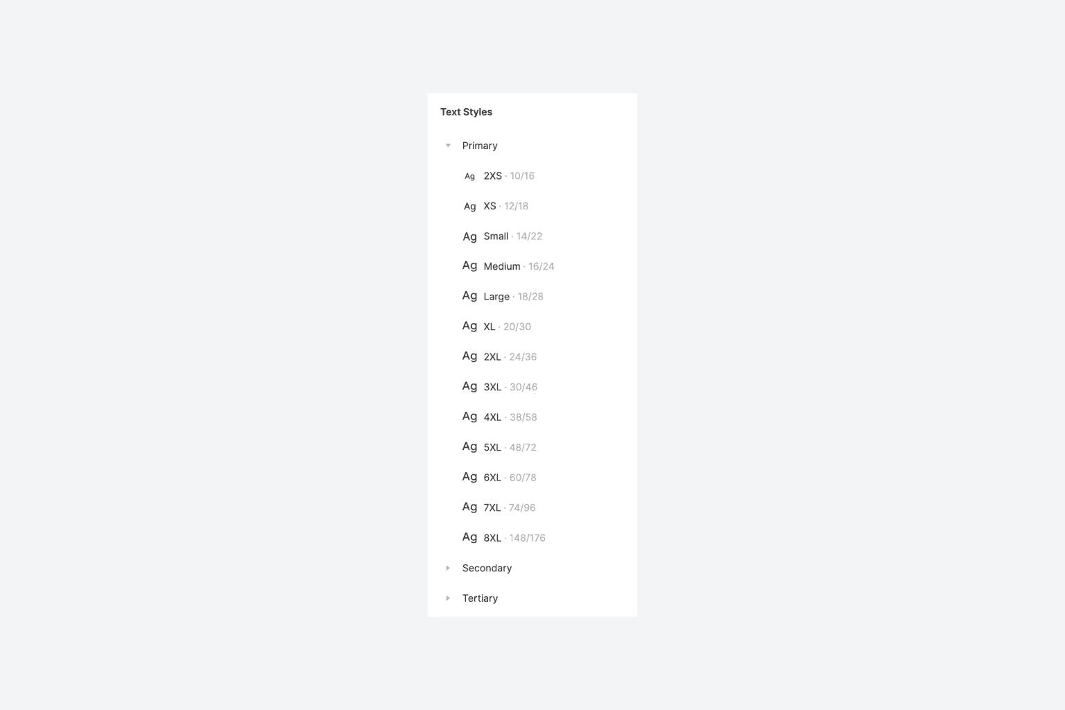
Type system
Creating a type system involves:
Assembling sizes of one or more typefaces with a suitable scaling method.
Setting fitting line-heights.
Incorporating different weights.
In my opinion, you don’t necessarily need a sophisticated ratio (like the golden-ratio, perfect-fourth, or major-third) to create a scale. Instead, set up a simple sequence with 8 to 12 sizes that works for you. However, if you like a math-based approach, check this site.
A popular way to organize type is by naming tokens according to their application, like Heading 1, Heading 2, Paragraph, etc. However, this can get inflexible quickly. It’s better to organize your tokens without naming them after specific use cases, as you can’t foresee in the beginning how font styles will be utilized later. Don’t force your team into a rigid system that can become a dead-end.
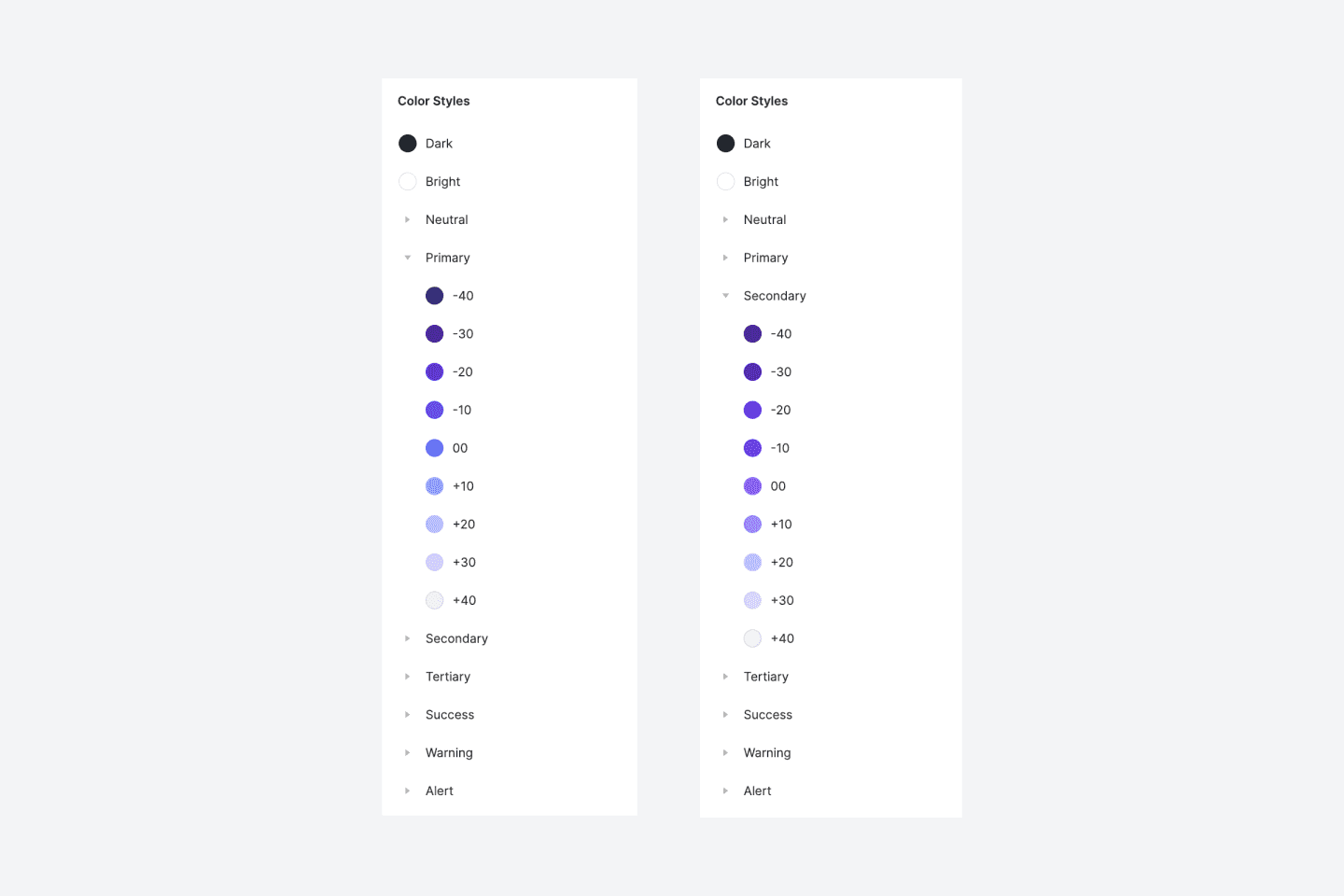
Color palette
A beautiful and flexible color palette is key to every project. Where beautiful is subjective, flexible can be described objectively: A flexible palette assembles colors with complementary tints and shades. Furthermore, colors and their variations should be interchangeable. For example, switching between a light Purple and a light Blue should feel natural. Also, swapping tints for shades in dark mode needs to work without issues as well. Finally, don’t forget to reserve status colors for success, warning, and error states.
For further reading, I wrapped my head around how to name colors in a design system here.
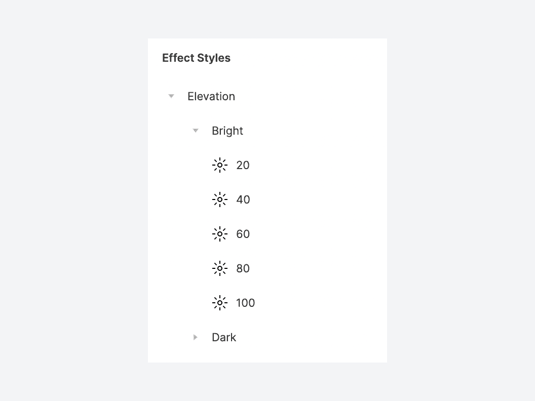
Effect presets
Making use of effects in interface designs involves foremost shadows and blurs. For example, shadows often get used for elevations and focus states. So, a small collection of pre-defined effects is valuable for any design system.
Spacing system
A spacing system comes with many benefits: Consistent aesthetics, less decision-making while preserving a quality rhythm between elements, better multi-platform design, and better communication between designers and developers. As most popular screen sizes are divisible by eight on at least one axis, a 4- or 8-point spacing system is the favorable solution by many experts, including Google’s Material Design team. However, it’s also fine to rock a 2-point spacing system as long as the approach is decided upfront and documented. For example, my starter kit encourages a 4-point spacing system that scales up from 4px to 256px along 12 steps to consistently lay-out items on a page.
Iconography
Icons help to make interfaces appear visually compelling and often allow users to scan for interactions faster (assuming the designer considers widespread conventions). So, a consistent icon library with plenty of options is helpful from the beginning. In addition, all icons should have the same aspect ratio and size to be swappable. It’s most common these days that icons get aligned, placed, and distributed in 24x24px frames. Check out my favorite icon system here.
Essential components
Nowadays, lots of development teams use frameworks like Angular or AntDesign as there are no resources for solutions from scratch. As a result, components like selects, sliders, input fields, or date pickers share UX patterns of these frameworks. Ideally, interface designs recreate these concepts when a development framework gets used to help keep technical debt low. It’s also beneficial to provide component variants with all states and different size options to keep the system as flexible as possible.
Component architecture
Tools like Figma provide excellent features to model smart components. When maintaining lots of variants, the following architecture is beneficial:
Base components that provide the foundational structure.
Re-componentized instances of these base components that get used for variants.
For example, adjusting the border-radius of a button’s base component automagically changes all variants and instances. Also, make sure that your components are as responsive as possible by setting constraints carefully: This helps to place instances into yet unknown contexts.
Library organization
Your system should aim for a clear yet lightweight organization. It should be easy for other users to find what they are looking for and understand how styles and components interact. Keep the structure as simple as possible as you won’t know how complex your library might get.
Conclusion
Hopefully, these key concepts will help you start creating scalable interface design projects and prevent you from running into dead-ends later. Feel free to check my starter kit, where I put this knowledge into action.