
Menu
Menu

What makes a logo valuable
A closer look at what makes a logo worth its price
Mar 31, 2015
I recognized that people in need of a logo often feel a little confused about paying more than expected for something that looks pretty simple at first. I set this post up to justify the costs and to explain some logo 101.
The truth about even the simplest logo is that it radiates values. A good logo should be recognizable and inspire trust, admiration, and loyalty. It’s a unique visual identifier and therefore pretty crucial to a brand’s recognition.
To craft such an identifier, a designer needs to ask the following questions:
Is the logo simple enough?
Is the logo memorable?
Is the logo enduring?
Is the logo versatile enough?
Is the logo appropriate?
Let me explain these points in detail:
Simplicity
Simple logos are often easily recognized, incredibly memorable, and the most effective at conveying the client's requirements. The most successful brands in the world run with a simple logo.
Memorability
An effective logo design is memorable. That can be achieved by having not only a simple logo but also an appropriate one. Nevertheless, there might be situations or branding strategies in which the logo can be entirely inappropriate to make it more memorable.
Timeless
A good logo should not follow any trends. Have you seen the Pepsi vs. Coca-Cola comparison? Coca-Cola has used almost the same logo since the beginning of the 90s, adjusting it slightly over time. Pepsi seemed dissatisfied with its past versions, leading to many different iterations. This comparison shows how a logo can subconsciously convey values: The winner in trust and loyalty is Coca-Cola.
Versatile
A logo should work across different media and sizes without losing its effectiveness. It should still work when it is:
set in one color
resized to a tiny piece
resized to a large piece
displayed with reversed colors (i.e., light logo on dark background)
Versatility ensures the logo remains flexible and works for use cases you might not even think of yet.
Appropriate
A logo design should be suitable for its intended purpose: it should support the overall branding strategy of the product, company, or individual. For example, a law firm’s logo should look more severe than a logo for a festival. Here are some pretty inappropriate examples.
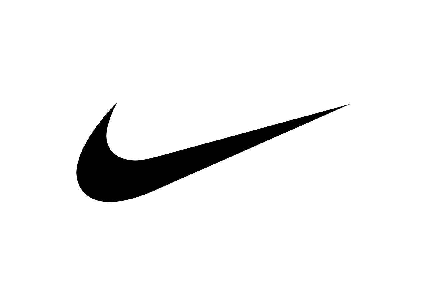
Appropriateness means that the logo doesn't need to show what a brand does. The Apple logo does not show a computer, nor does the Nike logo show a sneaker. A logo is more of an identifier, like a fingerprint.
Summary
The designer needs to understand the client’s ideals and beliefs and incorporate them into their design process while adhering to the principles described above. All in all, this is a time-intensive puzzle and a lot of work. However, a logo is always tied to the quality of the company it represents:
“If a company is second rate, the logo will eventually be perceived as second rate. It is foolhardy to believe that a logo will do its job immediately, before an audience has been properly conditioned.” Paul Rand
Subscribe to DRNR FM
My Substack publication explores the evolving world of digital design, from freelance practice to product strategy, UX/UI, and the tools shaping modern workflows.
Contact
Copy Email
Berlin,
Weather
°
Weather
Berlin,
Weather
°
Weather
What makes a logo valuable
A closer look at what makes a logo worth its price
Mar 31, 2015
I recognized that people in need of a logo often feel a little confused about paying more than expected for something that looks pretty simple at first. I set this post up to justify the costs and to explain some logo 101.
The truth about even the simplest logo is that it radiates values. A good logo should be recognizable and inspire trust, admiration, and loyalty. It’s a unique visual identifier and therefore pretty crucial to a brand’s recognition.
To craft such an identifier, a designer needs to ask the following questions:
Is the logo simple enough?
Is the logo memorable?
Is the logo enduring?
Is the logo versatile enough?
Is the logo appropriate?
Let me explain these points in detail:
Simplicity
Simple logos are often easily recognized, incredibly memorable, and the most effective at conveying the client's requirements. The most successful brands in the world run with a simple logo.
Memorability
An effective logo design is memorable. That can be achieved by having not only a simple logo but also an appropriate one. Nevertheless, there might be situations or branding strategies in which the logo can be entirely inappropriate to make it more memorable.
Timeless
A good logo should not follow any trends. Have you seen the Pepsi vs. Coca-Cola comparison? Coca-Cola has used almost the same logo since the beginning of the 90s, adjusting it slightly over time. Pepsi seemed dissatisfied with its past versions, leading to many different iterations. This comparison shows how a logo can subconsciously convey values: The winner in trust and loyalty is Coca-Cola.
Versatile
A logo should work across different media and sizes without losing its effectiveness. It should still work when it is:
set in one color
resized to a tiny piece
resized to a large piece
displayed with reversed colors (i.e., light logo on dark background)
Versatility ensures the logo remains flexible and works for use cases you might not even think of yet.
Appropriate
A logo design should be suitable for its intended purpose: it should support the overall branding strategy of the product, company, or individual. For example, a law firm’s logo should look more severe than a logo for a festival. Here are some pretty inappropriate examples.
Appropriateness means that the logo doesn't need to show what a brand does. The Apple logo does not show a computer, nor does the Nike logo show a sneaker. A logo is more of an identifier, like a fingerprint.
Summary
The designer needs to understand the client’s ideals and beliefs and incorporate them into their design process while adhering to the principles described above. All in all, this is a time-intensive puzzle and a lot of work. However, a logo is always tied to the quality of the company it represents:
“If a company is second rate, the logo will eventually be perceived as second rate. It is foolhardy to believe that a logo will do its job immediately, before an audience has been properly conditioned.” Paul Rand
Subscribe to DRNR FM
My Substack publication explores the evolving world of digital design, from freelance practice to product strategy, UX/UI, and the tools shaping modern workflows.
Contact
Copy Email
Berlin,
Weather
°
Weather